Favorite typeface: Hobo
April 14, 2010

All day long I knew I was forgetting something, but I couldn???t quite put my finger on it. About ten minutes ago, it hit me like a thunderbolt. Hobo.??
I had dutifully reported my current favorite serif and sans serif typefaces (Archer and Gotham, respectively). They are clean and modern and make any design look good.??
BORRRR-ING.
You all recognize Hobo. You know you do. You see it everywhere and it takes you right back to the groovy 1960s and?????70s. At least that???s what you think. Hobo was actually designed in 1910 by Morris Fuller Benton. I didn???t knock myself out, but after a few minutes of internet searching I failed to find much more about its history than the following:
The Hobo font is a dynamically tapering face in which all strokes are accentuated curves, achieving a superb decorative effect. Hobo almost suggests a freely drawn alphabet with its unusual robust roundness. The Hobo font was designed to be used at large sizes. It has no descenders: the lower case g, p, q and y are incorporated into the x-height. The Hobo font imparts a friendly personality to display work such as invitations, menus, signage and packaging. (reference)
And about its designer:
Morris Fuller Benton (November 30, 1872 ??? June 30, 1948) was an influential American typeface designer who headed the design department of the American Type Founders (ATF), for which he was the chief type designer from 1900 to 1937. Benton designed more than fifty typefaces, ranging from revivals of historical models like ATF Bodoni, to adding new weights to existing faces such as Goudy Old Style and Cheltenham, and to designing original designs such as Hobo, Bank Gothic, and Broadway. (reference)
Hobo don???t get no respect. In my office we joke all the time about using Hobo in our designs. And then when we???re acting out on our exasperation with client revisions, we declare that we will refine our design by outlining/inlining/adding a drop shadow to Hobo. We don???t mean it in a nice way.
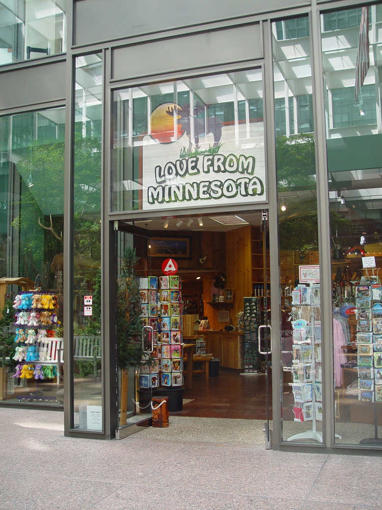
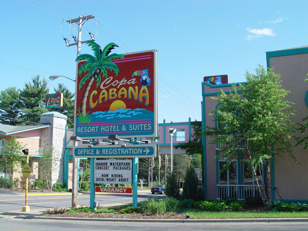
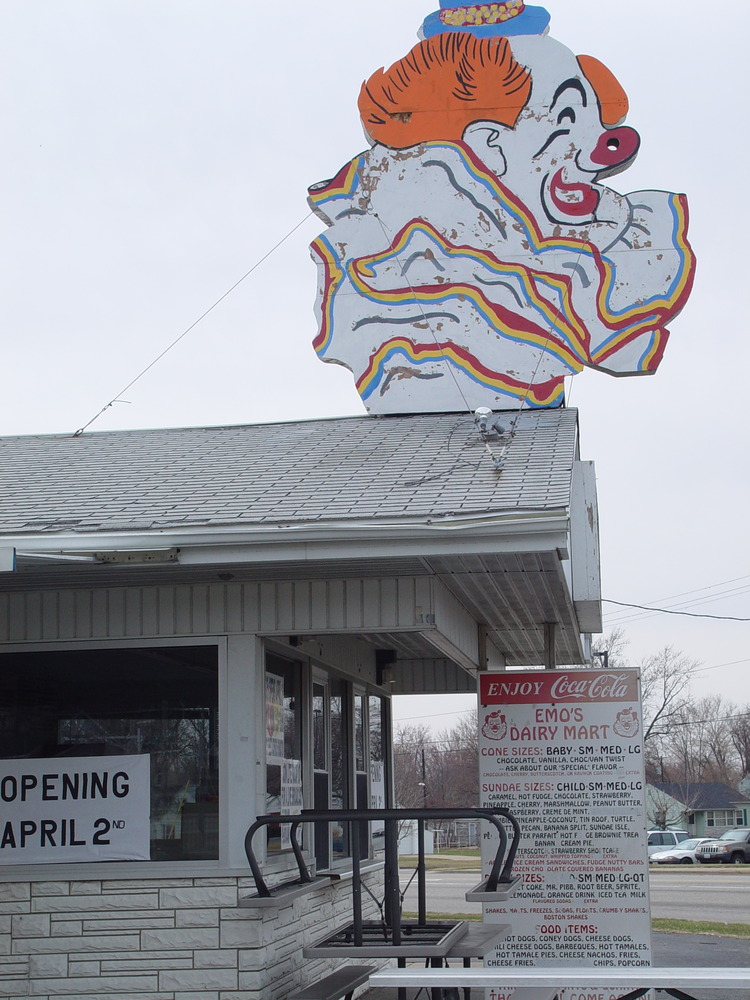
I got to thinking about why we treat Hobo so disparagingly. I???m always aware of when I see it out in the wild. One of the conclusions that I drew about why I pay attention to it is that beyond its surface hokiness, it is a darned readable typeface. From a distance, you know that it???s Denny???s Doughnuts (Rockford, Illinois), or Love From Minnesota (IDS Building, Minneapolis, Minnesota), or the Copa (barely readable) Cabana (Wisconsin Dells, Wisconsin), or that you should have Happy Feet (Mall of America, Bloomington, Minnesota), or that Ginny Smiths [sic] the best stand for cappuccino/coffee/milk/ice cream (Minnesota State Fair, St Paul, Minnesota). When you???re at Emo???s Dairy Mart (Peoria Heights, Illinois), reading the menu isn???t the hard part. The hard part is making a decision.
No, I think how you feel about Hobo is quite similar to how you feel about Lawrence Welk???you???re embarrassed to admit you like it because it???s so forty years ago, but there???s no denying it???s a classic with mass appeal.


Side note: The whole time I was typing this, I was totally seeing this Helvetica or Arial (or whatever my default font in TextEdit is) as Hobo. Hobo text. There is no such thing. I am hallucinating.
Click to visit my Flickr set of even more Hobo photos, which I have been inspired to take to participate in the Hobo 2010 project which commemorates Hobo???s centennial.
